What Is a Responsive Website? [Video]
Table of Contents
In the past, a website was a website, and if you had one it was good enough.
But things have changed a lot.
Today, if your website is not mobile friendly you can be in serious trouble.
A mobile friendly website is a must-have for any website owner, whether you are a small business or blogger.
Why is a mobile friendly website so important?
According to Search Engine Land, 60 percent of searches now are from mobile devices.
That is more than half!
As you can see, a mobile friendly site is also important in terms of SEO.
As more than half of the searches are done on mobile devices, Google took this into account and already started rewarding websites that were mobile friendly back in 2015.
In other words, if a search is done on a mobile device and your website is not mobile-friendly it will not show up in the top results which is where you want to be.
What is the difference between mobile friendly and responsive?
Mobile friendly is when a website can be viewed on a tablet or mobile device. In other words, the user experience is still pleasant even though you are not viewing the website on a computer.
Responsive web design is one of the methods used to create a mobile friendly website.
But before we go into detail about responsive web design, let’s have a quick look at the other methods used to create a mobile friendly website.
Fluid web design
This type of web design was one of the first methods to take into account different screen sizes.
Before the term “responsive” was coined, there was fluid design.
So what is fluid design then?
Fluid design is when percentages are used instead of fixed widths.
Adaptive web design
This type of web design tries to cater for all the different screen sizes available, which can be difficult due to the number of devices available.
So in other words, you will have different versions of an element, like your menu, for example.
One version for desktop, another for tablet and one for mobile.
Responsive web design
As you can see there is more than one way to create a mobile friendly website, but for today we will only be focusing on the responsive method.
Below is a video explaining a responsive website.
Quickly find out if your website is responsive
A quick way to see if your website is responsive is by using the inspect tool built in the Chrome browser.
Step 1:
Right click on your website and click on the “Inspect” option in the menu.
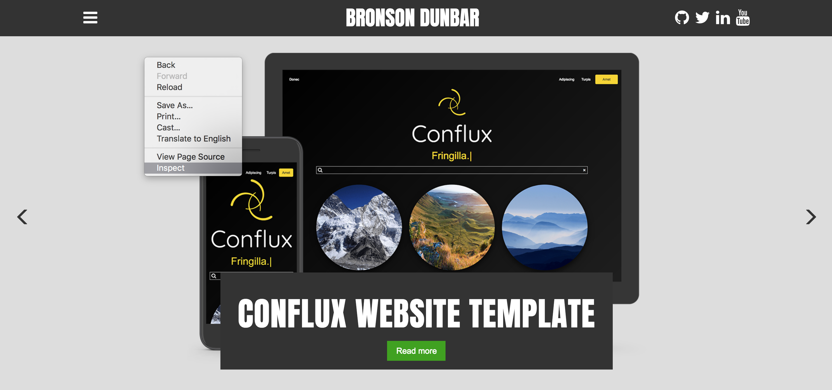
Inspect website
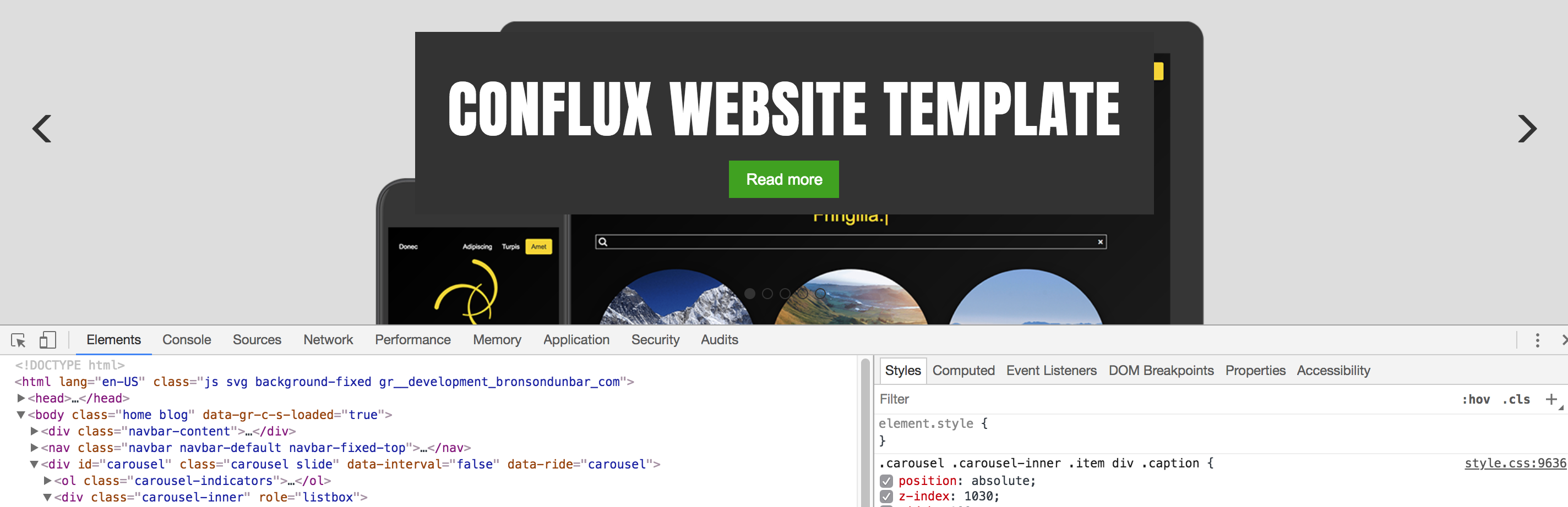
Step 2:
The inspect window will display. In the inspect window, click on the “Toggle device toolbar” button.
Step 3:
You will now see that there is a drop down at the top of your website with a few options.
In this drop-down you can select a set of pre-defined options for previewing your website on different mobile devices such as an iPhone and iPad.
Keep in mind that this might not always be 100% accurate. So be sure to also view the website on the actual device.
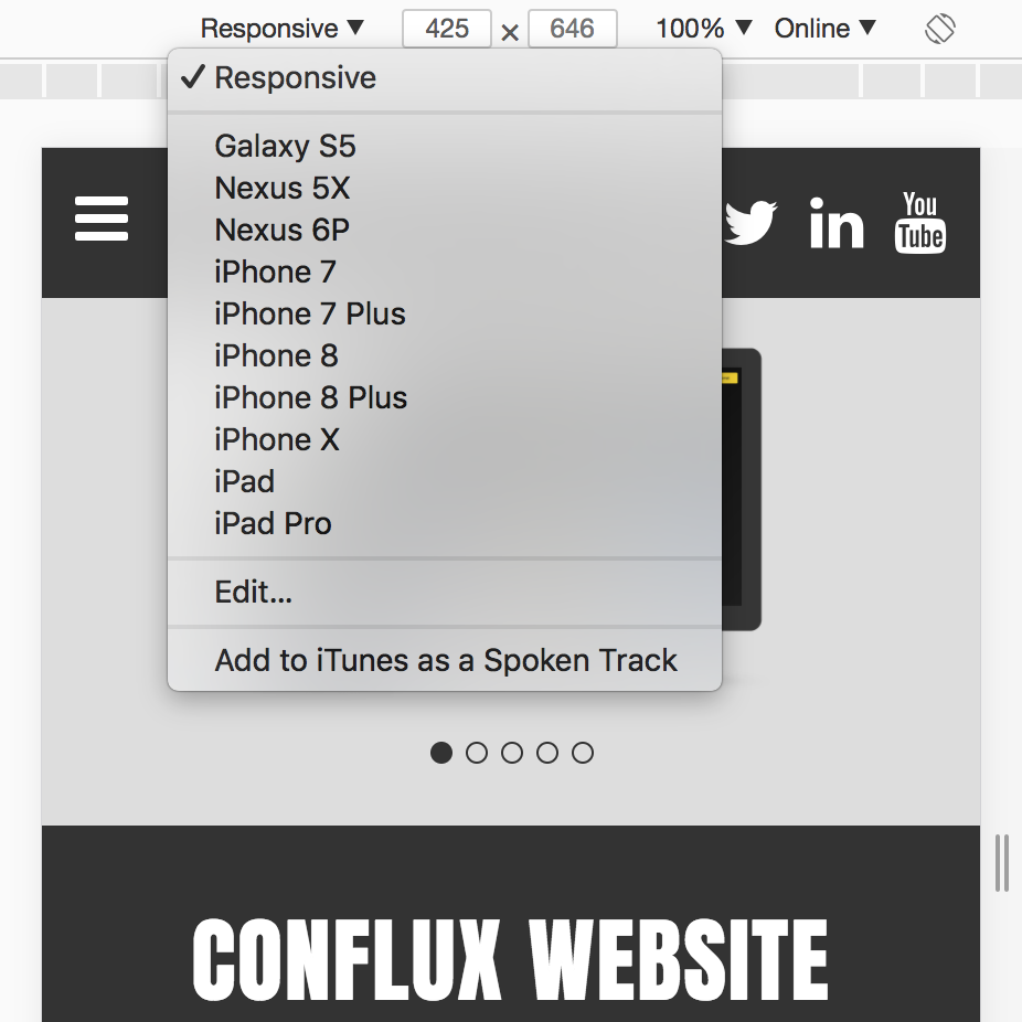
Device toolbar options
Step 4:
There are more options available than just the values in the drop down.
By clicking on the “bars” below the drop down you can select other options, such as a laptop resolution.
You can also re-size the window for a custom screen size.

I hope you enjoyed this post, and if you have any questions or comments, please let me know below.